Prototyping at the Speed of an Idea
Prototypes took half a day and followed a script. Now they take minutes, behave like the live app, and people well beyond design can build their own.
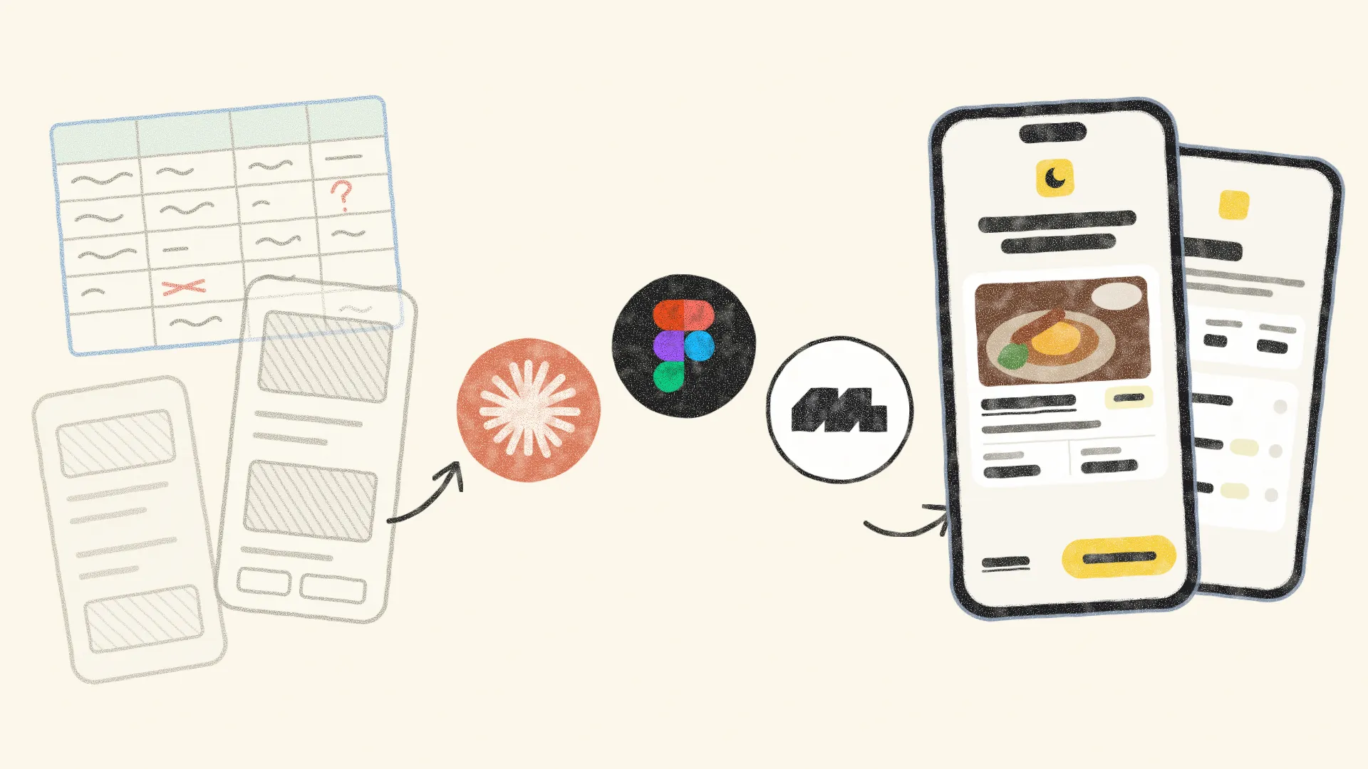
All Change
EatClub chose to adopt AI early. For design, the real change was how cheap a fix had become.
At EatClub, AI arrived as a company-wide bet, not a side project. Rather than wait for the tools to settle and someone else to write the playbook, the business chose to build Claude into how every team works and learn by using it. The aim was simple: less time on repetitive work, and more on the problems that need judgement.
For design, the first result was small and came quickly. I had recently built mockups for a potential enterprise partner, and making them look real meant filling in every venue and offer by hand: the image, the venue details, the offer amounts and the logic behind them. It’s the kind of work designers put up with, because building a tool to fix it usually takes longer than doing it. With Claude, it didn’t. Within a few days I had Refill working: a Figma plugin that fills a whole mockup with realistic venues and offers in one pass.
That changed the maths on every other chore. Once a tool takes days rather than months to build, the question stops being whether a fix is worth building and becomes which one to build first. And the list went well beyond design: the same approach could help the rest of the organisation spot problems, shape ideas and test them.
On Rails
When a prototype takes half a day, it only gets built for the path you already believe in.
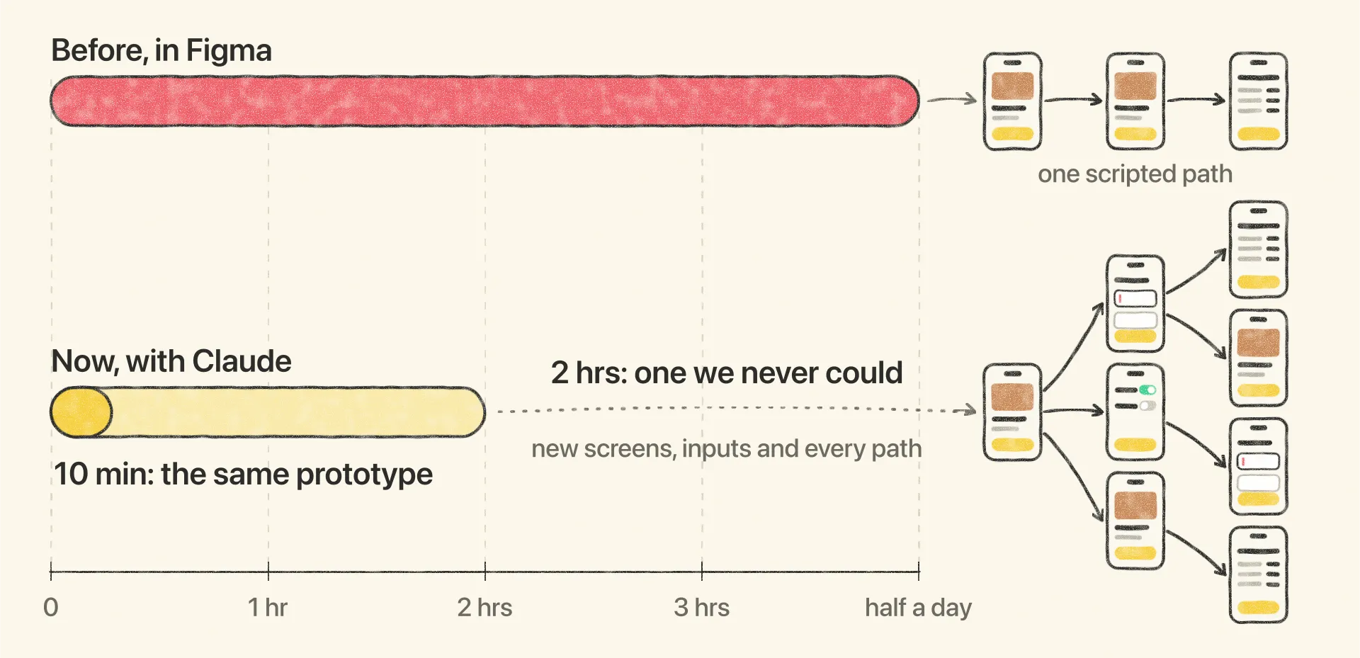
Of everything on that list, testing had the most to gain. A good prototype for a new feature took anywhere from a few hours to half a day in Figma, depending on how far we pushed the interactions and the realism. The cheaper option was a set of loosely linked screens, or just stills, and neither held up once a participant started tapping around.
Even the good prototypes ran on rails. Participants could only follow the path we had wired up, which meant we never saw anyone reach a feature another way or try something we hadn’t planned for. The content gave it away too: every offer carried the same placeholder numbers, which didn’t add up or carry through to the end of the flow, and participants were quick to point it out.
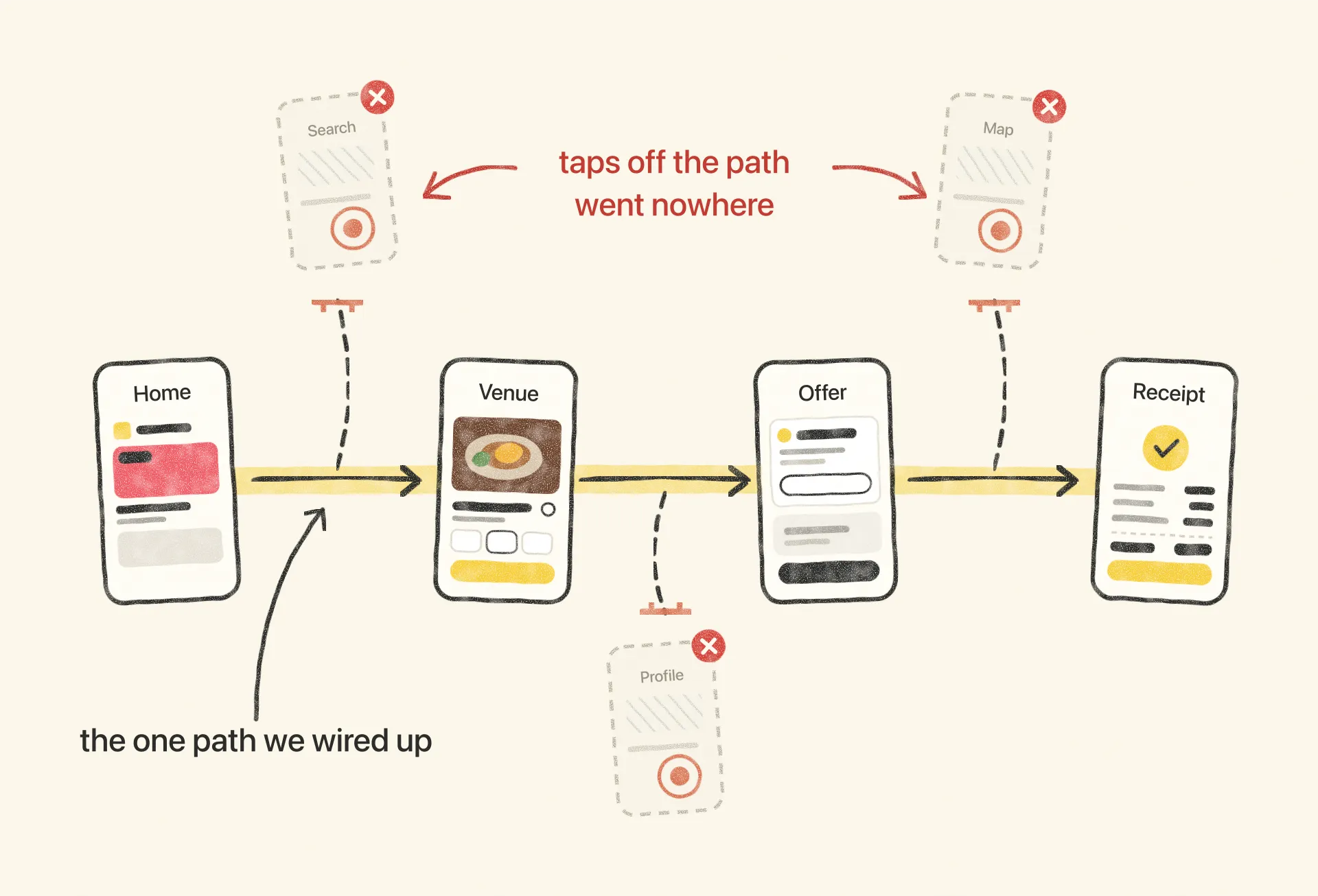
The cost also decided how many ideas made it in front of people, and how much of each. When we explored ideas around sharing, we could only build the first few screens, then describe the rest and ask participants to imagine it. Each of them may have been reacting to a slightly different idea, and we had no way of knowing.
A prototype that only shows the planned path can only confirm the plan.
Laying the Track
A faster prototype only helps if it behaves like the real app, and that meant building the foundations first.
Making prototypes quicker on its own would have produced the same scripted flows and placeholder numbers in less time. What testing needed was a prototype that behaved like the app itself, and that started with two foundations: a design system and a data layer.
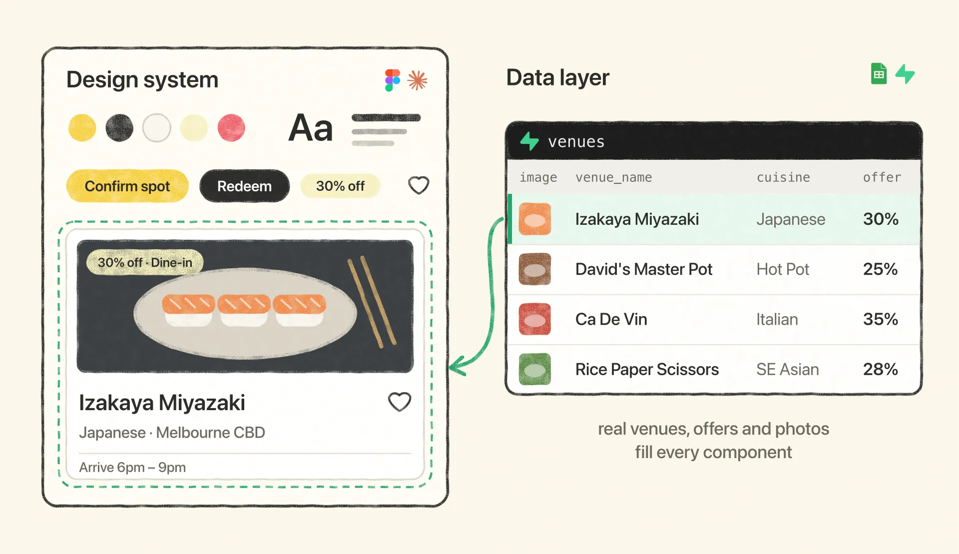
The design system is what makes the result near 1:1. I built it in both Figma and Claude Design, and in Claude Design every component comes with the rules for when and how it’s used. A prototype starts from a set of Figma designs and a short write-up of the flow. Anything that already exists in the app is rebuilt from the same components, and anything new is built in EatClub’s style rather than a generic one.
The data is what makes it believable. I connected the design system to a deliberately low-fi spreadsheet of venues, offers, images and locations, so deals fill in the way they do in the live app. A participant can compare offers logged in and logged out, as a member or not, and follow the maths all the way to the receipt, which is exactly where the old prototypes ran out of numbers that made sense.
With the foundations in place, I added two tools on top so the prototypes could go after real problems rather than the ones we guessed at. An aggregator keeps a health check on the business, pulling in analytics, team docs and support tickets to flag where something is slipping. An idea engine turns those signals into options worth exploring, so a problem reaches the prototype already backed by data.
The last layer was Mobbin, added so that people without a design or product background could explore ideas too, starting from patterns in real, shipped apps rather than a blank page.
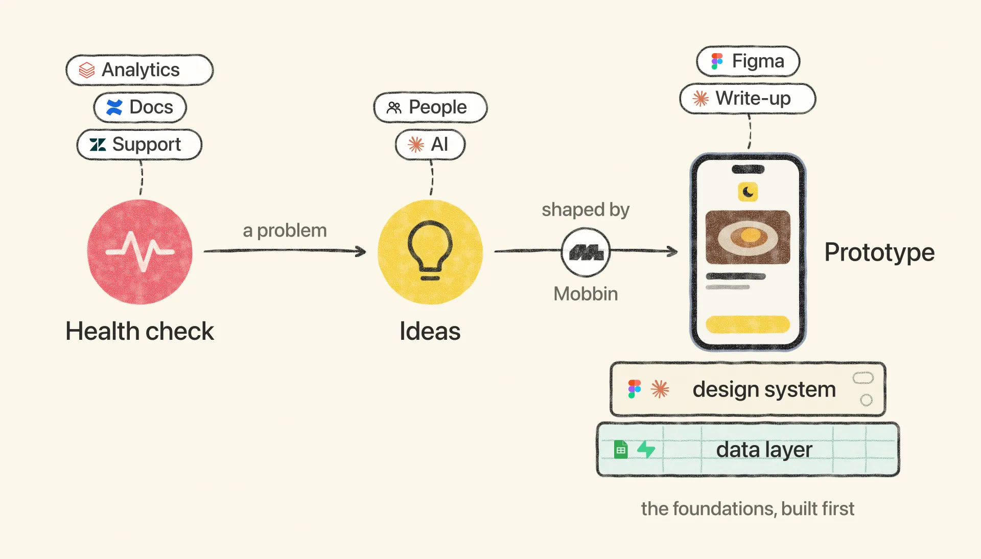
None of it works without the foundations. The design system and the data layer had to exist before the first prototype could be built, and every hour saved since has depended on them.
Off the Rails
Once the prototype behaved like the app, participants stopped following our script.
With real paths and real numbers underneath, sessions started to look less like people completing a task and more like people using the app. Participants reached the same screen by different routes, and tapped outside the flow we were testing because something caught their eye. Instead of steering them back, the researcher could ask about whatever they had chosen to explore, in the moment, and the answers were far more honest than anything we got from walking people down a path we had picked for them.
The clearest example came from the numbers themselves. Because offer amounts now carried through every step to the receipt, participants could check the maths as they went, and testing showed how much of their understanding rested on a single icon. The Spark, which marks what a diner earns, was doing a lot of the work in explaining where the numbers came from. So we shipped a change: where the app once used a quieter plain-text breakdown, the Spark now appears wherever earn or loyalty is involved. A prototype full of placeholder figures could never have shown us that.
That freedom comes at a cost. As with testing on the live app, a curious participant can wander far enough to derail a session, and keeping it on track without priming them takes a researcher who knows when to follow and when to steer. It’s the price of realism, and one we’d pay every time over another session spent on rails.
All Aboard
Product managers can now explore ideas on their own. Design still decides what they become.
The product managers I work with can now explore ideas themselves, test them, and ship low-risk bets. In our jam sessions, they can also bring a rough idea in a form everyone can react to, and we refine it together from there.
The earning bands on partner profiles started that way. A new partnership needed them at short notice, and the PM’s early versions made it clear what the partnership had to communicate. I took the design from there: I settled on a single approach, stripped it back, and built it on a pattern we had already proven in an earlier feature, so it arrived consistent with the rest of the app.
A working prototype also settles arguments that words can’t. In one recent case, an idea came to the team mid-cycle, framed as a quick addition to work already sliced into sprints. Rather than debate it, I built it out in depth, and the PM, tech lead and I used the prototype to show what it would really take. Its complexity was obvious once it was on screen, the sprint plan held, and the work is now scheduled with its edge cases already mapped.
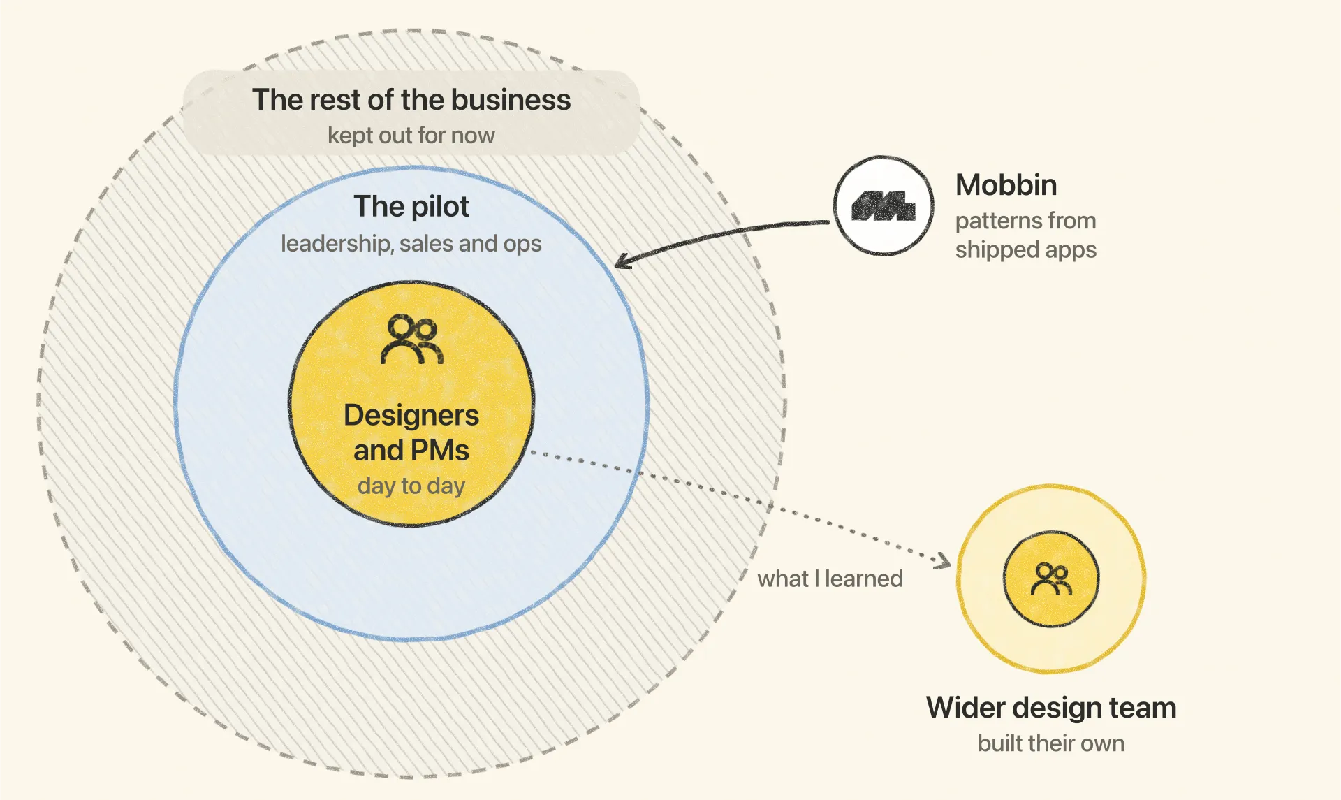
I’m now testing whether the same setup works for people who know the business deeply but not product design, from leadership to sales and operations, as a pilot I proposed and took through the proper approvals. For them, Mobbin does the heavy lifting. It’s a large library of screens and flows from real, shipped apps, connected to Claude through its MCP server so Claude can search it directly. When there’s no existing design to start from, the tools pull in relevant patterns and build from those, and an idea from outside the product team starts on proven ground rather than a blank page.
The approach has since spread beyond the two teams I look after. I shared what I learned building the design system for Claude with the rest of our design team, and we’ve built on it together, each shaping it for our own area.
Mind the Gap
Claude will tell you something is right when it isn't, so someone still has to check its work.
Its biggest weakness is confidence. Claude will call something correct when it’s wrong, and say it convincingly enough that anyone could take it as fact, so every output still needs someone who knows the product to vet it. Give it too little to work from and it falls back on generic solutions that could belong to any app. That’s why every prototype starts from real designs in Figma or, where none exist yet, from patterns pulled in from Mobbin.
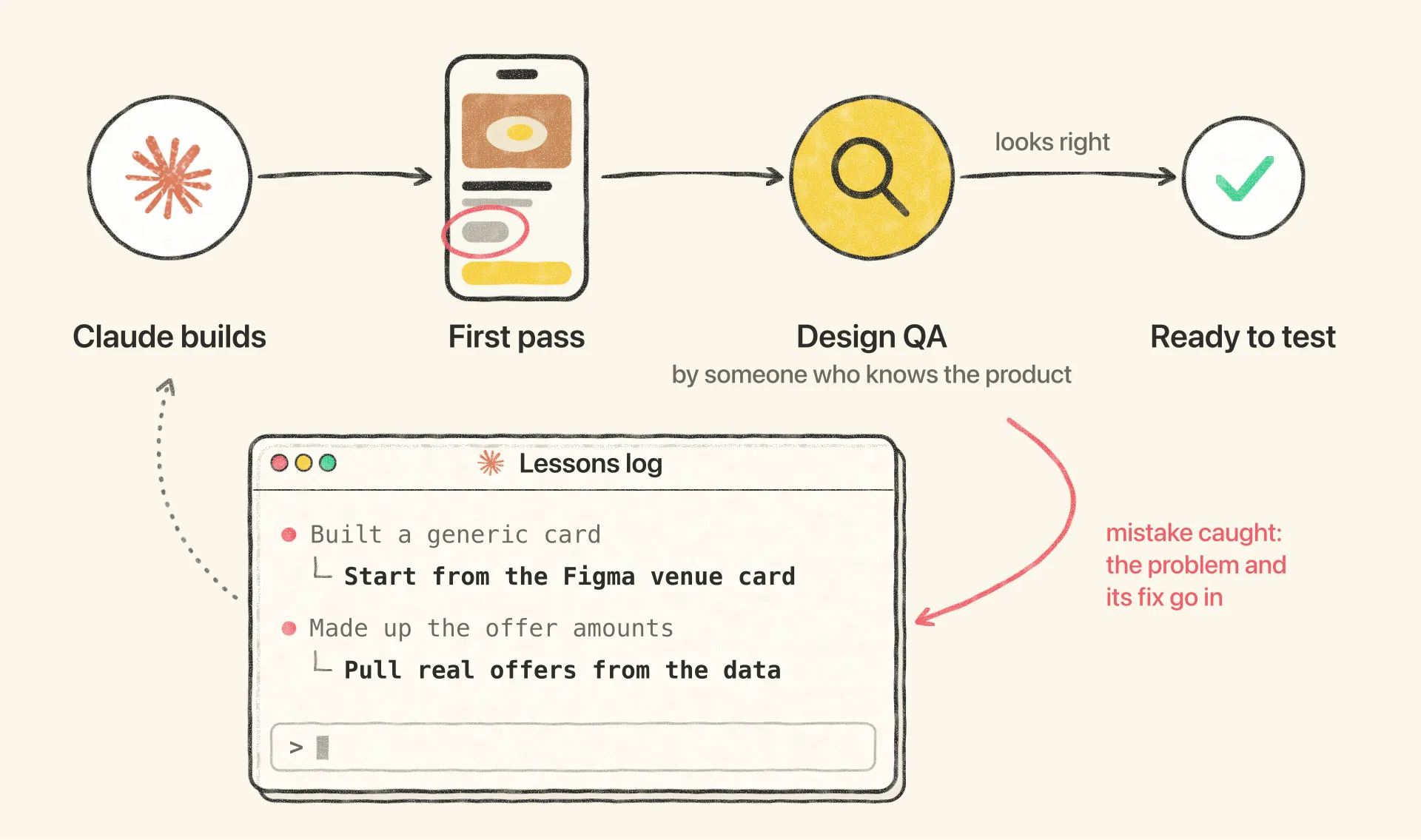
We manage the rest with a lessons log. Every time the agent misreads something, or works in a way that leads to the wrong output, the problem and its fix go into the log, so each new session starts from everything the last one learned. Long sessions get the same discipline: once a conversation has run long enough to drift, it gets summarised and restarted with a clean slate.
Keeping the circle small was deliberate too. Day to day, the tools belong to the designers and product managers I work with, and the rest of the business comes in through the pilot rather than all at once, because opening them up fully would bring a flood of product requests and ideas from every direction.
Picking Up Speed
What used to take half a day now takes minutes, and the time left over goes into prototypes we could never build before.
Prototypes used to be something only a few features got, saved for the ideas that could justify half a day of wiring screens together. Now nearly every large feature gets one, and building a working version has become the default way the team explores an idea rather than an exception we plan around.
The time has come down sharply. A prototype of the quality we used to spend half a day on in Figma can be ready in around ten minutes. I’ve put one together for a simple flow in the time before a meeting started, and it was close enough to the live app to test with.
The bigger change is what a couple of hours buys now. With less time than a good Figma prototype once took, I can build something far more ambitious: net-new screens and interactions, fields people can type into, logic that responds to what they do, and multiple paths, states and conditions to test in a single session. That’s the kind of prototype we couldn’t have built before at any cost, and it’s what made the testing in “Off the Rails” possible.
The Scenic Route
Faster isn't always better for thinking, and knowing the difference is part of the job now.
For all the speed, Figma hasn’t gone anywhere. Some problems are still easier to think through on a canvas, where I can push things around by hand and watch an idea take shape. Prompting can be just as quick, sometimes quicker, but it trades that tangibility away, and that changes how the creative part of the work feels.
I don’t see that as a flaw in the tools. Designers have worked one way for decades, and we’re partway through learning another. Part of the craft now is knowing which problems need the express and which are worth the scenic route.